To create a standout online presence for your pizzeria, it’s essential to stay updated on the latest pizza website design trends. These trends focus on enhancing the user experience, driving online orders, and making your site visually appealing. Here are the top pizza website design trends you need to know:
1. Minimalist Design with Bold Visuals
- Modern pizza websites focus on clean, uncluttered layouts that highlight key elements like menu items and promotions.
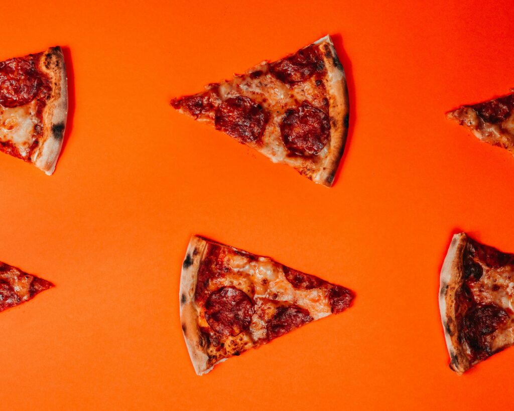
- Use high-quality images of pizzas front and center to grab attention. Bold fonts paired with simple backgrounds allow your food to shine.
2. Interactive and Dynamic Menus
- Add a dynamic, interactive menu that allows users to customize pizzas, view ingredients, and instantly see pricing updates.
- Incorporating motion or subtle animations (e.g., pizza toppings being added visually) can make the experience more engaging.
3. Mobile-Optimized Design
- With more customers ordering via smartphones, a mobile-first approach is essential.
- Design your website with responsive layouts that adjust perfectly to any screen size, ensuring a smooth ordering experience.
4. Seamless Ordering System
- Focus on reducing the number of clicks it takes to place an order. Implement a three-click ordering process where customers can select a pizza, customize it, and checkout in just a few taps.
- Include easy reorder buttons for returning customers.
5. Personalized User Experience
- Leverage customer data to offer a personalized experience. Show users past orders, favorite pizzas, and recommendations based on their preferences.
- Integrate personalized offers or discounts to boost conversions.
6. Dark Mode
- Offering a dark mode option is becoming increasingly popular. It reduces eye strain, especially for late-night users, and gives your website a sleek, modern look.
7. One-Page Checkout
- Simplify the checkout process with a one-page checkout, making it faster for users to complete their orders.
- Include guest checkout options, payment autofill, and multiple payment methods like Apple Pay, Google Pay, and credit cards.
8. Engaging Videos and GIFs
- Use short videos or GIFs to show pizzas being made, highlighting freshness, toppings, and preparation. This adds visual interest and excitement, drawing users in.
- Background videos of the kitchen or delivery process also create a connection with your brand.
9. Geolocation Features
- Implement geolocation tools to automatically display nearby locations, estimated delivery times, and available pickup options.
- This streamlines the process and makes it easier for customers to find your nearest pizzeria.
10. Sustainability and Local Sourcing Highlights
- More consumers are interested in sustainability. Use your website to highlight any eco-friendly initiatives, like sustainable packaging, locally-sourced ingredients, or community involvement.
- Use graphics, badges, or icons to show this prominently.
11. Sticky Menus and CTAs
- Keep your menu and call-to-action buttons (CTAs) like “Order Now” sticky on the screen as users scroll through your website. This makes it easy for them to place an order at any point without searching for the button again.
12. Storytelling Through Design
- Incorporate your brand’s story—how the pizzeria started, what makes it unique, or your family traditions—into your website design.
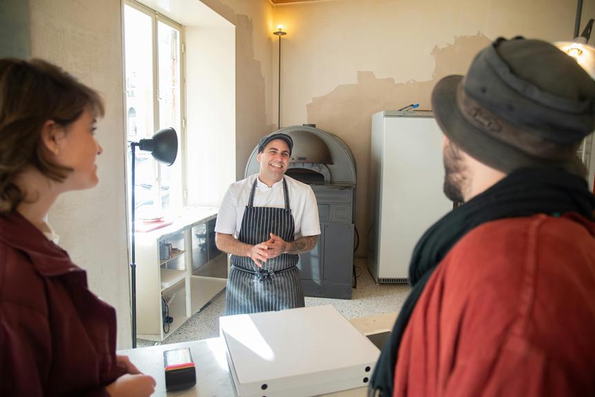
- Use storytelling visuals like illustrated timelines or imagery of your team at work to build a deeper connection with customers.
By integrating these pizza website design trends, you’ll create a user-friendly, visually appealing site that makes ordering easy and keeps customers coming back.


